Menu Bar > Tools > Charts
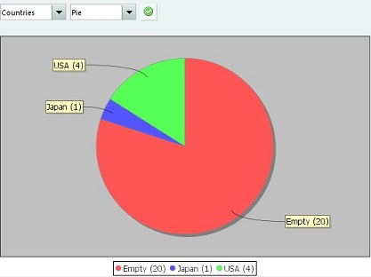
Every module has the chart tool available. The chart tool allows you to easily create a simple chart. In the first list you can select the field on which the chart should be based. In the second list you can select the chart type (such as a pie chart or a bar chart). After making your selection, press the button. Items having no value set for the selected field are represented by the “empty” category.
Example #
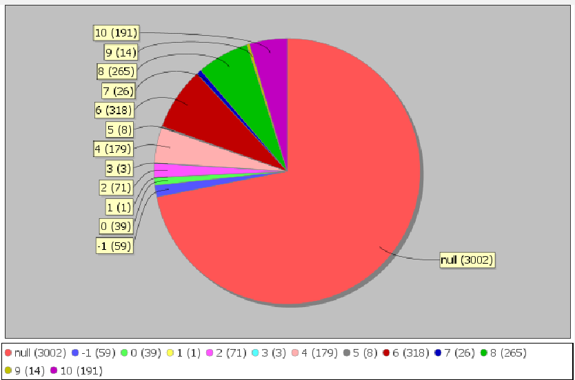
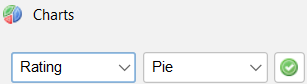
Let’s say you would like to have a visual presentation based on the rating of each movie. Do you have more 4 stars rated movies then 3 stars rated movies? Select the rating field and press the ![]() button.
button.
Data Crow will generate a chart representing the number of movies having a specific rating. In the below there’s a fair number of movies not having been rated yet, telling me I might have some work to do but does give me a good insight on how I rated my movies.